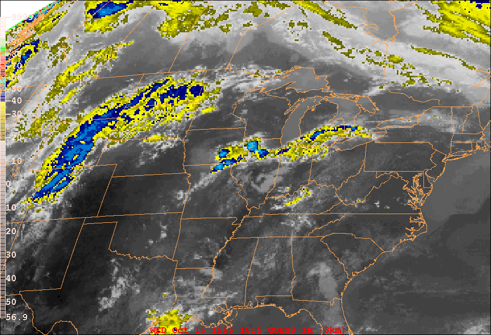
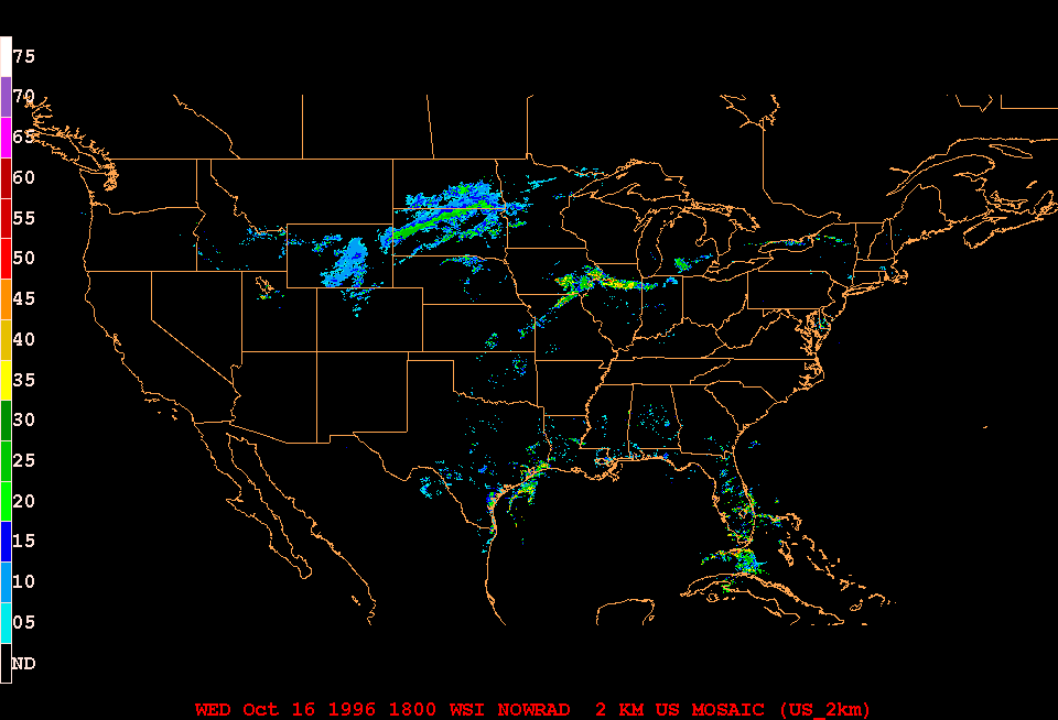
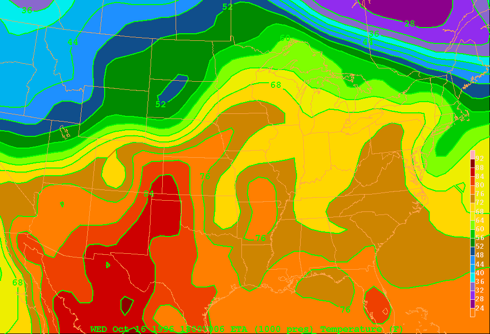
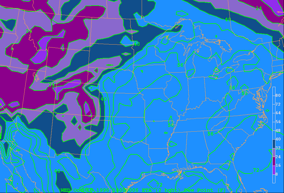
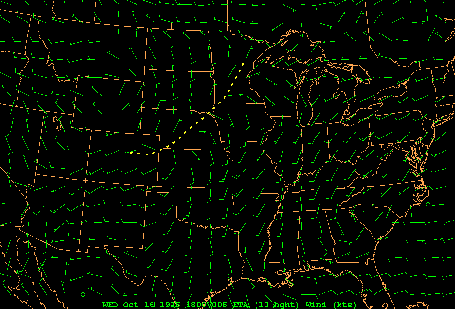
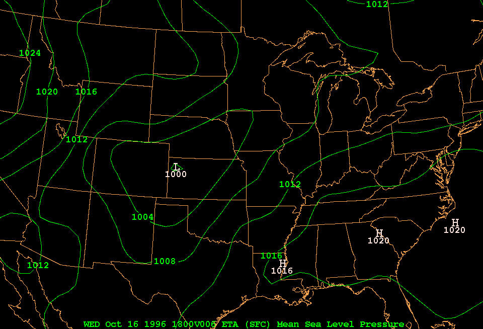
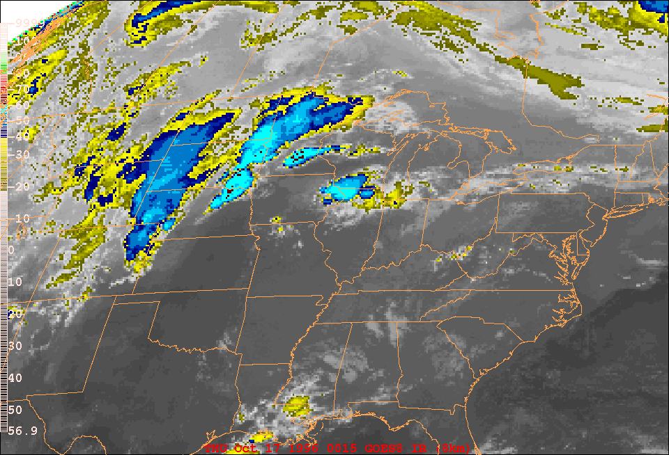
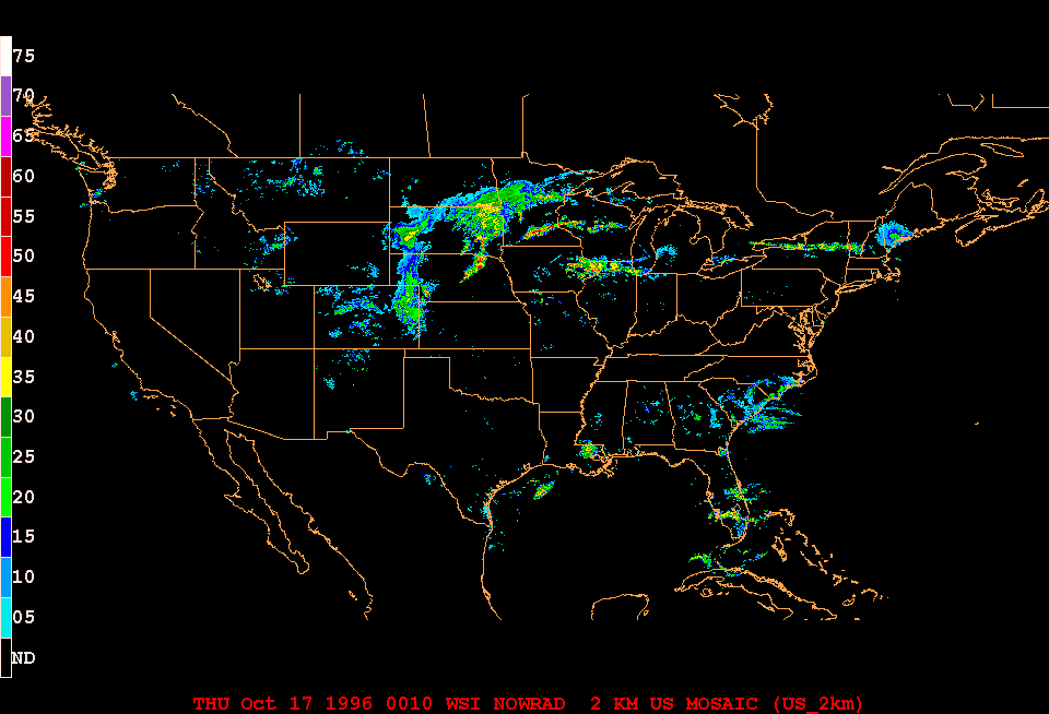
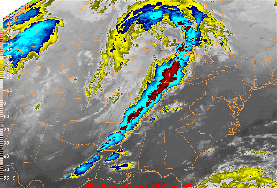
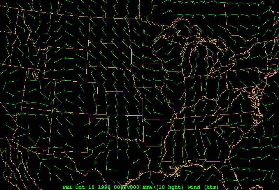
This relates to question 4 in your lab manual. First view the following animations of a developing frontal system. The animations are all 36 hours long, starting at 18 UTC on 16 October 1996.
The above data are the main resources meteorologists have at their disposal when they analyze weather charts. Such charts display station observations, plotted using a standard you learned about in the first Lab. These charts are still made by hand, and meteorologists use available satellite and radar imagery, as well as guidance from numerical weather prediction models, to pinpoint the location of fronts, lows and highs.
During the lab session this week, you will analyze the chart of surface weather observations at 00 UTC on 17 October 1996. But first, we need to become familiar with contour analysis.
So try these exercises first. [Note: it is best to open this link in a new window]
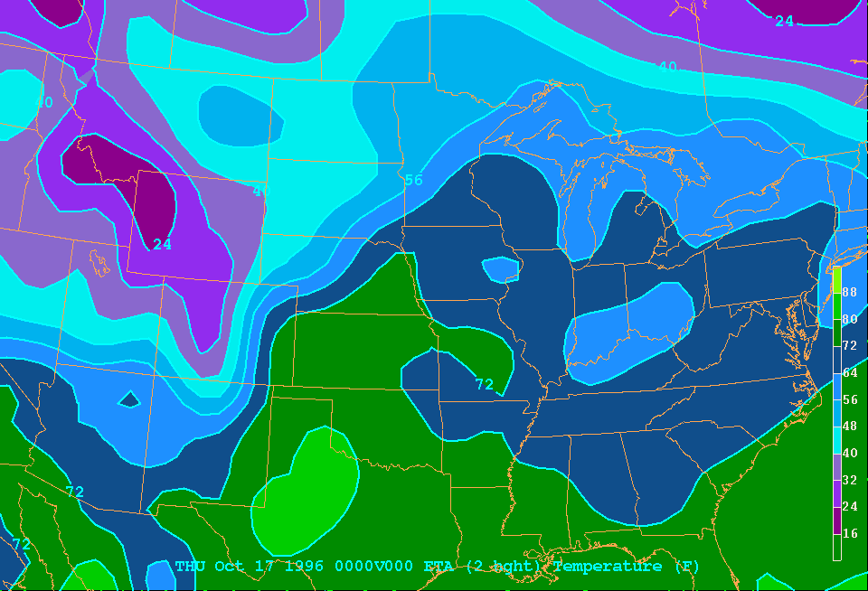
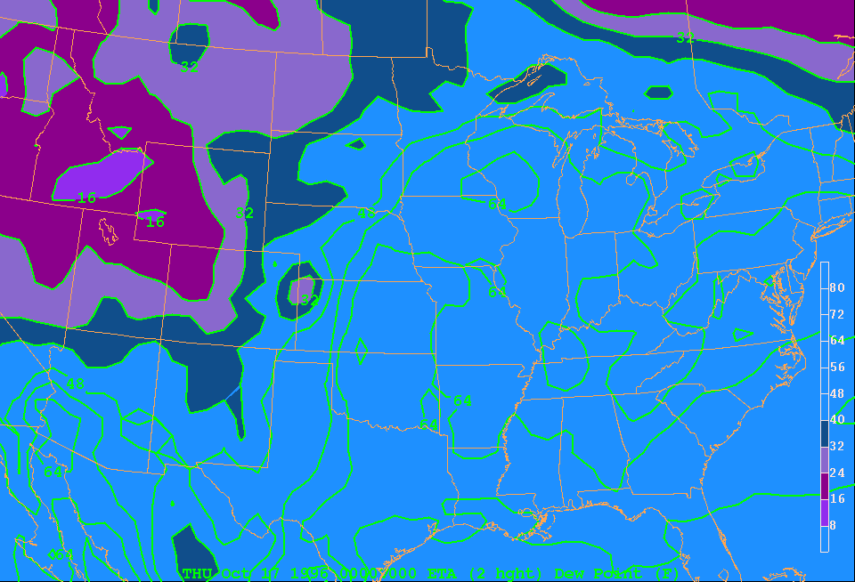
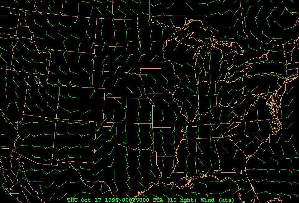
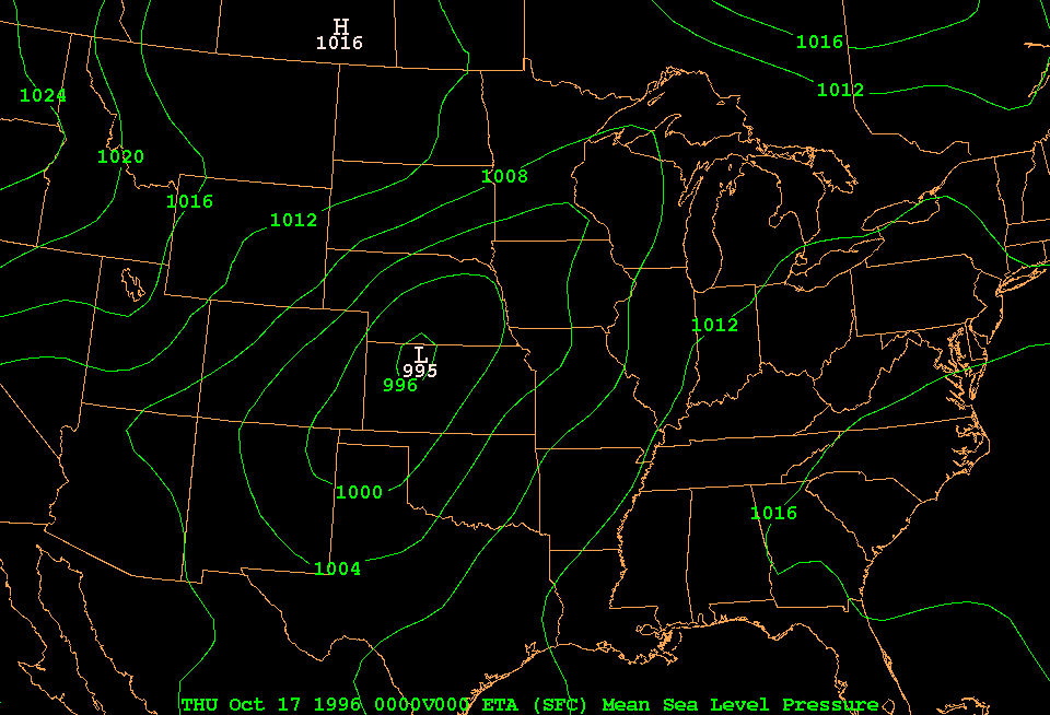
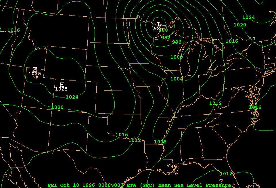
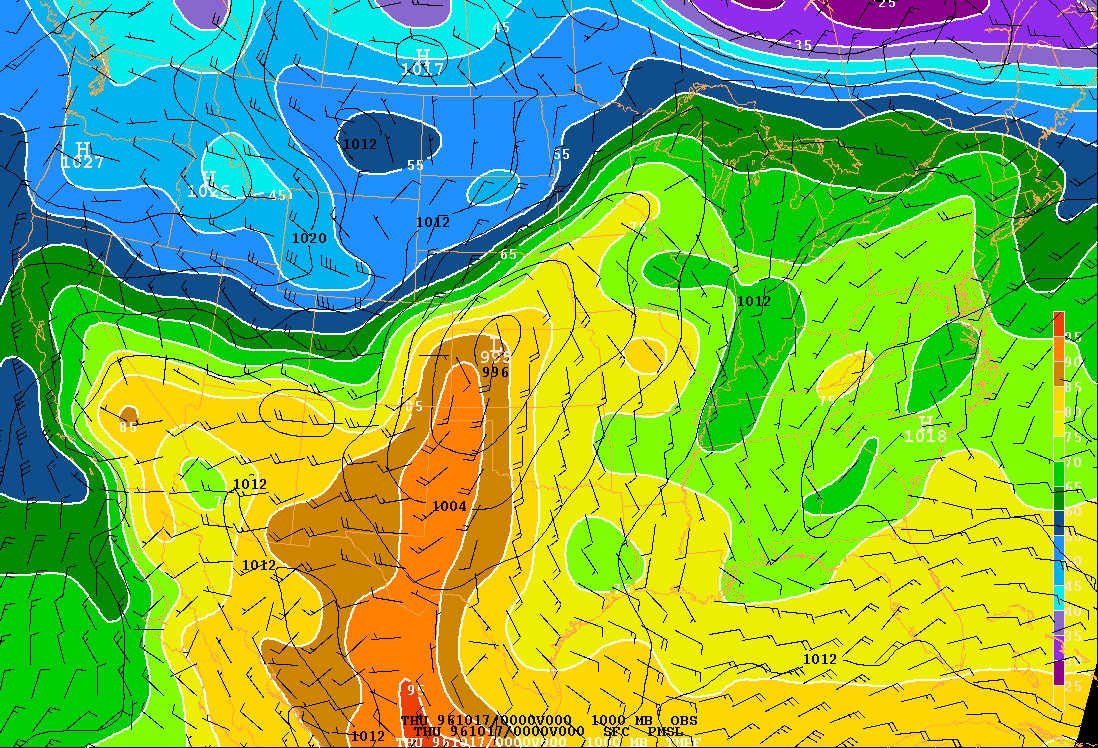
Today you will act as meteorologist on duty at the National Weather Service, and analyze the chart of surface weather observations at 00 UTC on 17 October 1996. This chart is included as an appendix in your lab manual. Before you start analyzing , go through the image sequences listed in the Pre-lab above again, and then look at the same data at 00 UTC on 10/17/96:
Now you are ready to analyze the chart of surface weather observations at 00 UTC on 17 October 1996. The lab manual tells you more about how to locate the front and how to draw isobars. Isobars are contours of constant pressure. The sea-level pressure is shown in the upper right of the conventional station plot. Remember that you have to add 9 for values over 500 (e.g. 976 means 997.6 mb) and add 10 for values under 500 (e.g. 045 means 1004.5 mb). Make sure to use a pencil, and have your eraser handy.
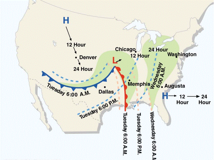
Post-lab XI: The passage of a cold front
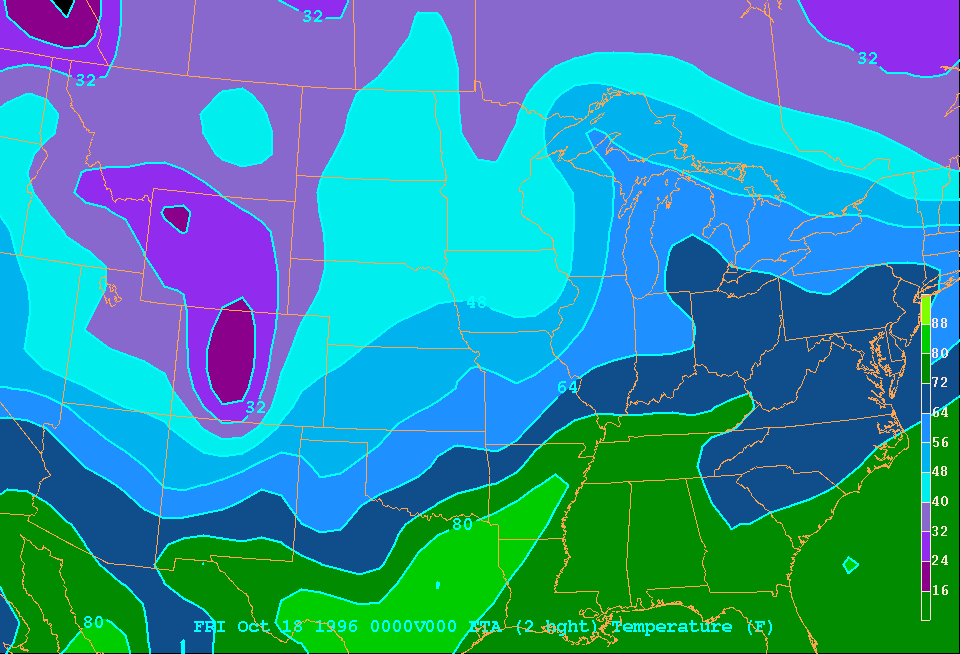
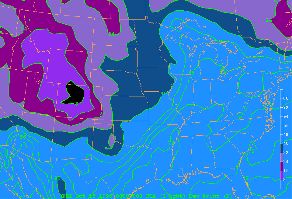
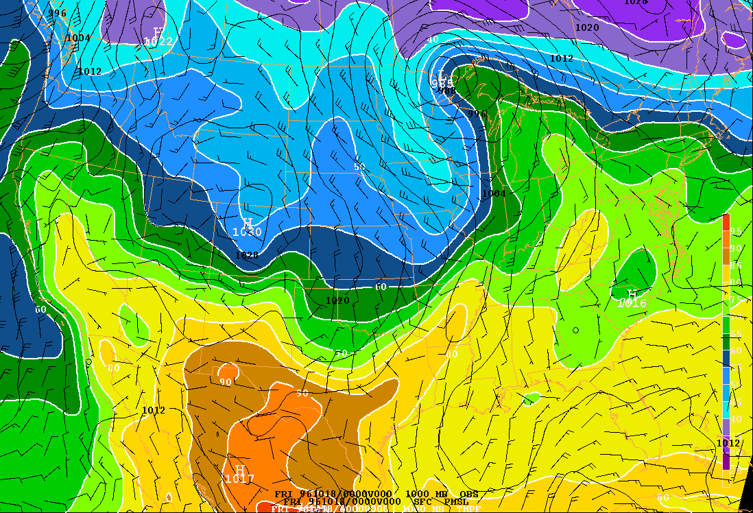
For this assignment you use the experience gained in the lab session to analyze the surface weather chart 24 hours later, at 00 UTC on 18 October 1996. This chart is in your lab manual. You will need to hand in the hand-analyzed chart. Here are some clues, valid for 00 UTC on 18 October 1996:
Compare the positions of the cold front and low on the 10/18 00Z chart to those on the 10/17 00Z chart, which you hand-analyzed before the lab. Hint: examine this Figure from the textbook. Now return to your lab notes.
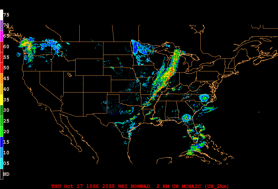
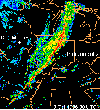
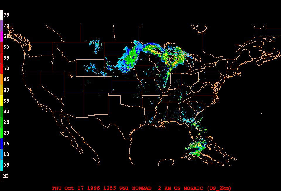
Examine this radar image, valid for 00 UTC on 18 Oct 1996.
1. In what type of airmass is Indianapolis in the radar image shown?
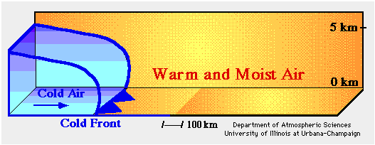
2. In what type of airmass is Des Moines IA, at the same time?According to the textbook, a vertical transect through a cold front looks like this:
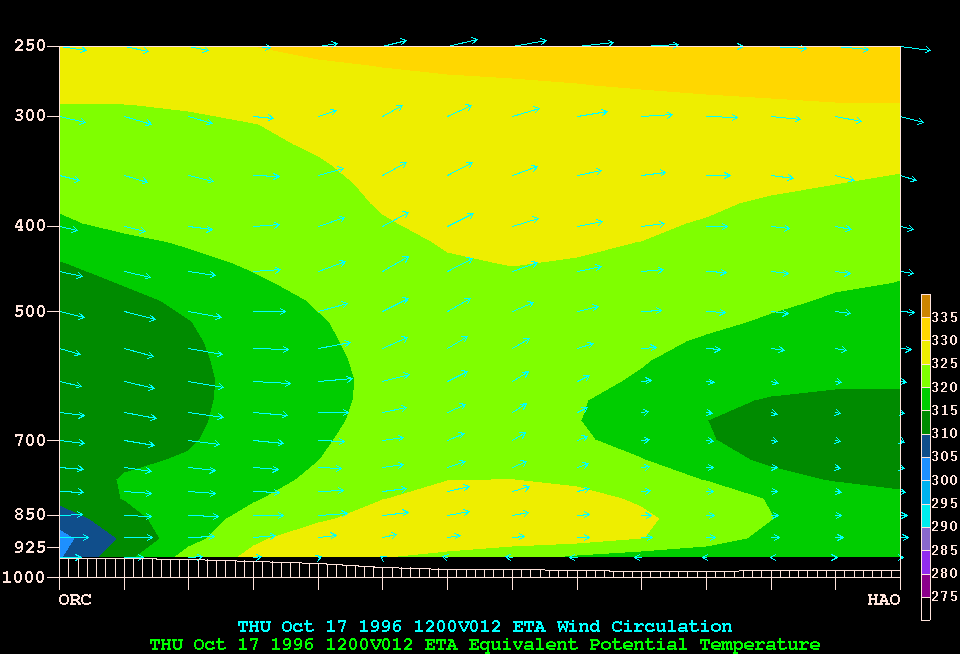
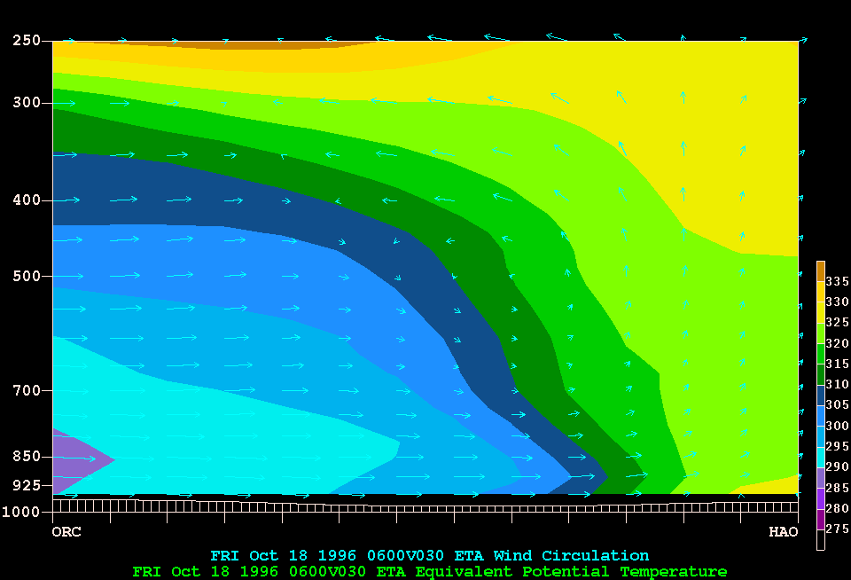
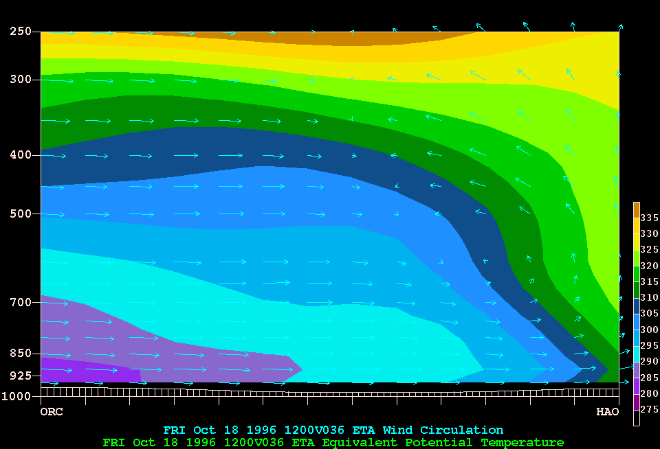
Now examine an animated cross section from Des Moines to Indianapolis, valid for 24 hours starting at 12 UTC on 17 Oct 1996. This cross section is based on model output, it does not show the clouds and thunderstorms. The color field in the cross section, for instance at 06 UTC on 18 Oct, shows the energy contained in the air. The lower values (blue and purple) correspond to cold, dry air, while higher values near the surface indicate moist, warm air. The atmosphere may be unstable when there is more of this energy at low levels, and less above it, and this instability implies that thunderstorms may develop. For instance when yellow (higher value) occurs below green (lower value), thunderstorms are possible.
3. Does the frontal surface slope back to the west, or forward to the east?
4. Determine the depth (or height) of the cold, dry airmass at 12 UTC on 18 Oct. (hint: determine the pressure level of the dark-blue belt [305-310 K] in the cross section, and convert that pressure value to height, in kilometers, using this table or Appendix H in the textbook)
5. Estimate the speed of the cold front from the animated cross section, and compare to the speed you obtained in Q8 of the Lab. (hint: the length of this cross section is 650 miles, and the sequence of images lasts 24 hours)
6. You have already seen that a line of thunderstorms develops. On the radar image, it can be seen as a red-orange line, indicating strong radar echoes or heavy rain, Such line of vigorous thunderstorms is known as a squall line. Look at the radar animation again. At what time does the squall line first form? Express time in UTC, as well as CST.
7. Why do you think it started at that time of the day?
8. You also know from the radar image that the cold front (the line of thunderstorms in the radar image) is 80 miles west of Indianapolis at 00 UTC on 18 Oct. Using the speed you calculated in Q5, predict the time at which the cold front will pass through Indianapolis.
We are going to examine the evolution of the jet stream as seen on a polar stereographic map (the north pole is in the center). This animation starts with yesterday's position of the jet, and follows it for the next 9 days. The maps show wind speeds, and the jet can be seen as the belt of strongest winds. Let's go to the MRF (medium range forecast) page on our weather server. Make the following choices:
Notice how the jet stream moves. Look for jet streaks (wind speed maxima) and trofs (southward dips in the jet). Return to the MRF window and change the Forecast variable from "Loop" to "24 Hours". How many major streaks do you now count in the jet stream around the northern mid-latitude belt? How many major trofs?
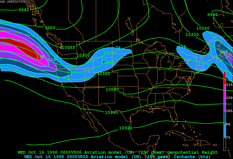
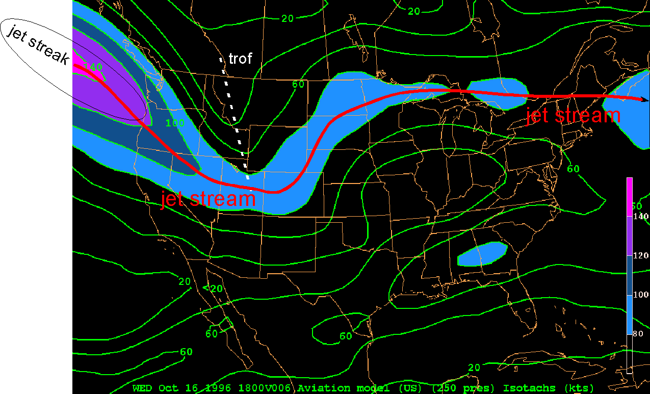
We return to our 16-18 October 1996 case study. Look at this jet stream animation over North America. Describe what happens to the jet streak in the jet stream as it moves from the west over the Pacific Northwest and eastward. Relate the jet streak to the amplifying trof (to interpret jet stream patterns, click here).
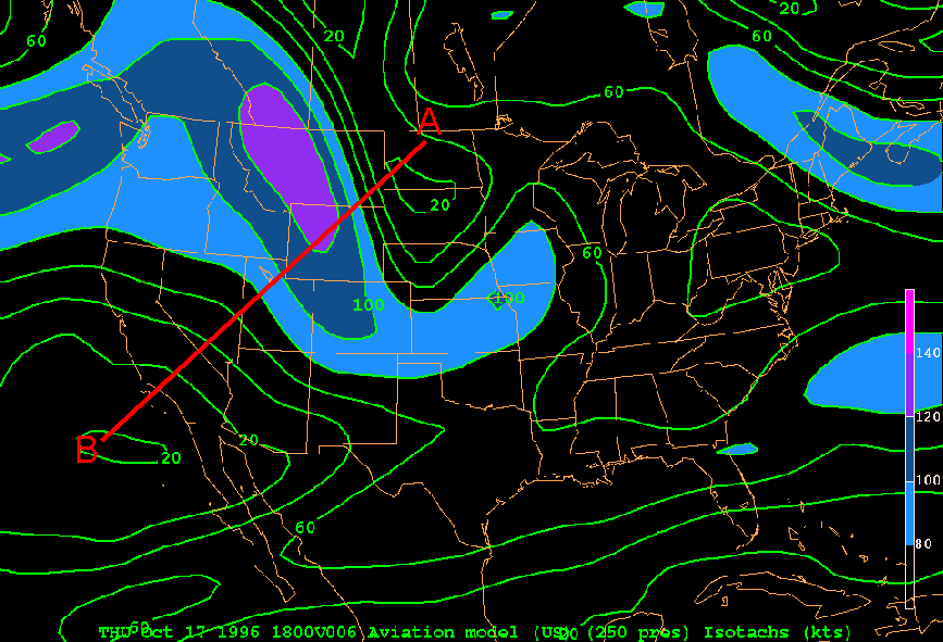
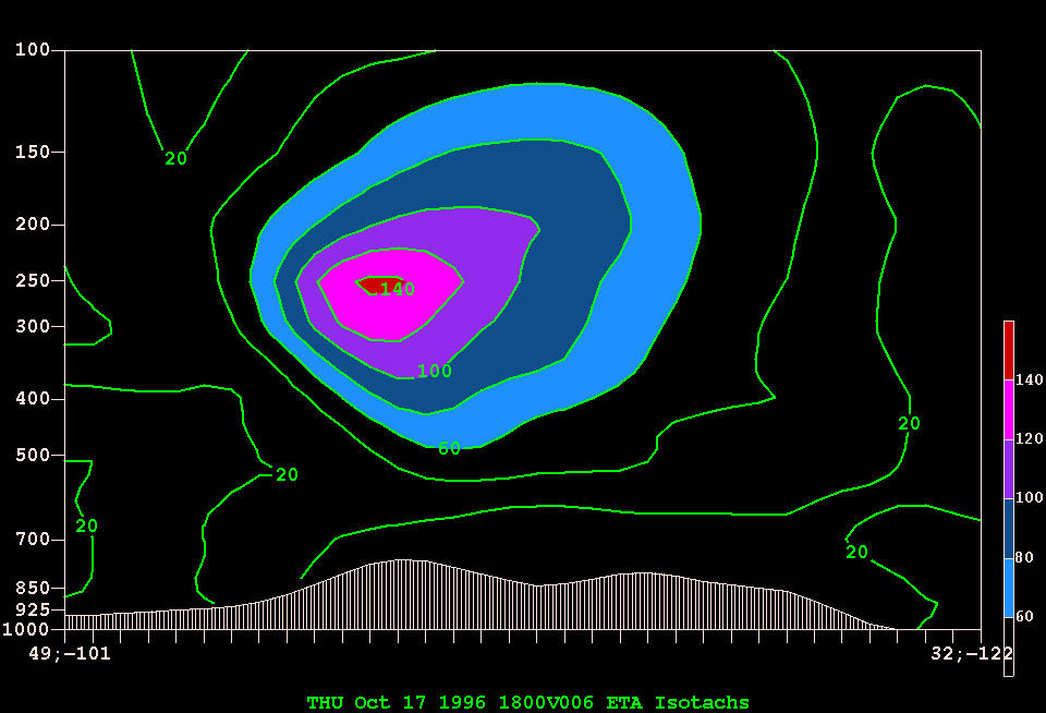
Finally,
let's dissect the jet from A to B on this map. The
vertical cross section of wind speeds is shown here.
At what altitude is the jet strongest? Again convert
pressure to height.
a. Vertical structure of lows and highs, trofs and ridges
First, let us examine the vertical structure of the atmosphere. Data for upper-level charts are based on radiosonde observations. We explored surface weather charts in Lab XI last week. Upper-level charts can be hand-analyzed in exactly the same way as surface charts, but we are not asking you to do that. Instead, we ask you to trust the contouring done by computer. Professional meteorologists don't hand-analyze upper-level charts anymore either.
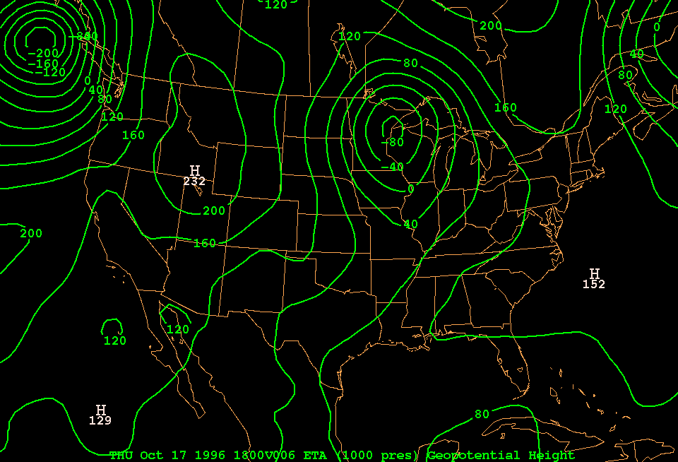
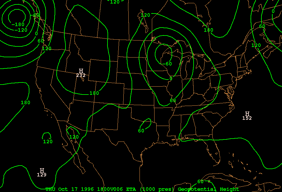
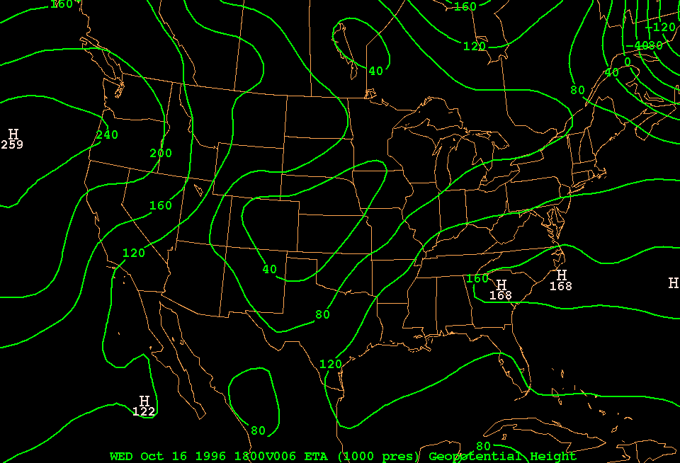
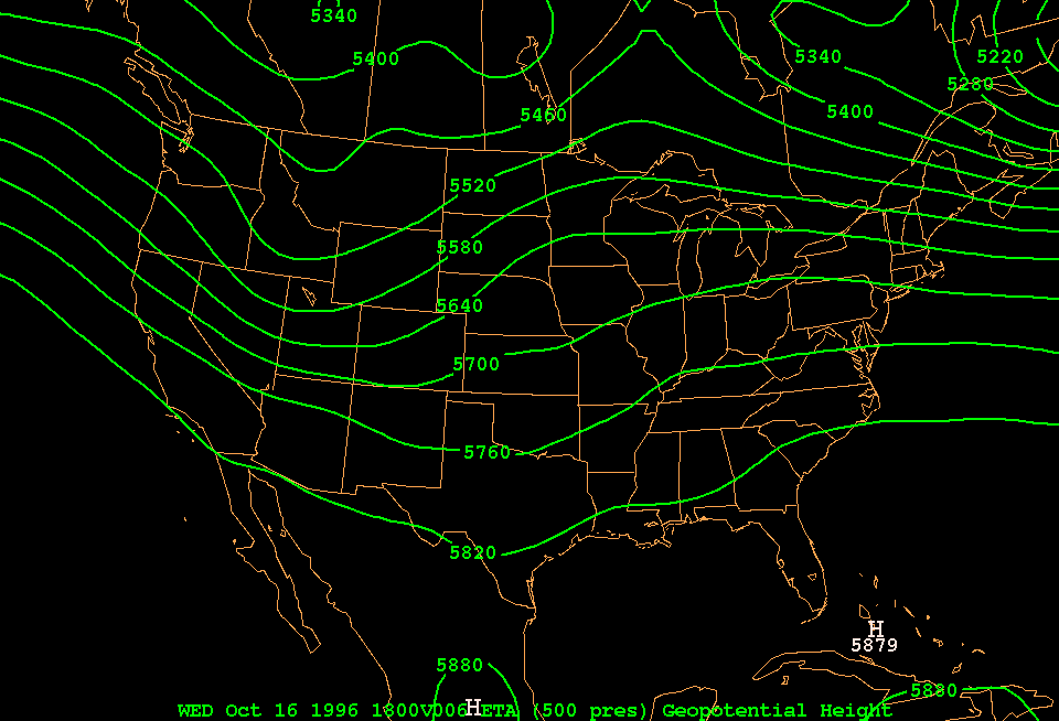
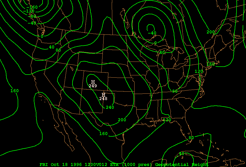
Surface weather charts contain isobars (lines of constant pressure) assuming that this pressure is valid at sea level. Upper-level charts can be done in the same way, for instance isobars on a chart at 10,000 ft above sea level, or at 40,000 ft, which corresponds to the height of the jet stream. Meteorologists usually look at topographic undulations of constant-pressure surfaces, for instance the 500 mb surface. This sounds confusing, but the saving grace is that the more intuitive map of pressures at some fixed height aloft looks almost identical to a topographic map of some constant-pressure surface. Lows remain lows, highs remain highs, and trofs and ridges remain the same. To convince yourself, compare this 1000 mb topographic chart to the corresponding sea-level pressure map. You can see that the only real difference is that height contours are used instead of isobars. These height contours are really the same as you would find on a USGS topographic map, but instead of contouring the terrain, they contour the topography of some invisible pressure surface. Pressure is really material, even though you cannot see it. Since the pressure at sea level is near 1000 mb, the 500 mb level is the height that splits the mass of the Earth's atmosphere in two. If the 500 mb surface is high, the air below must be less dense, ie relatively warm. This is explained in the textbook. To picture at what height a certain pressure level (eg 500 mb) is, on average, look at this conversion table.
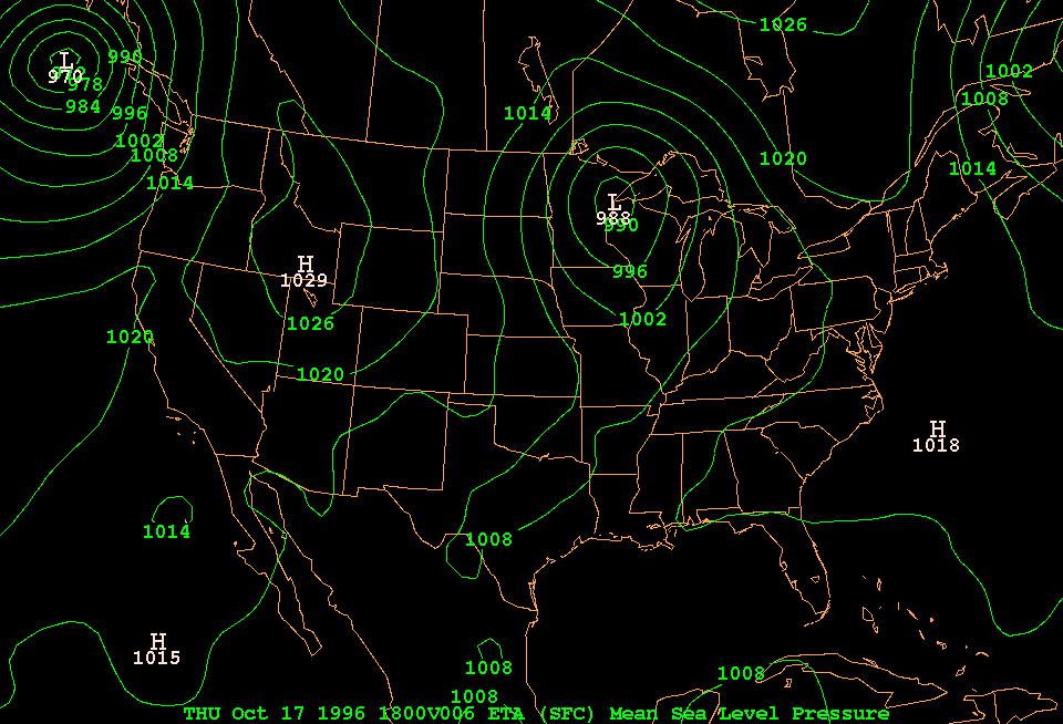
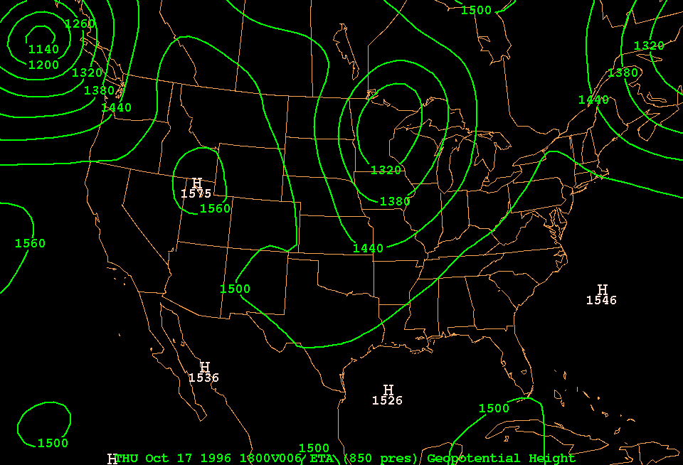
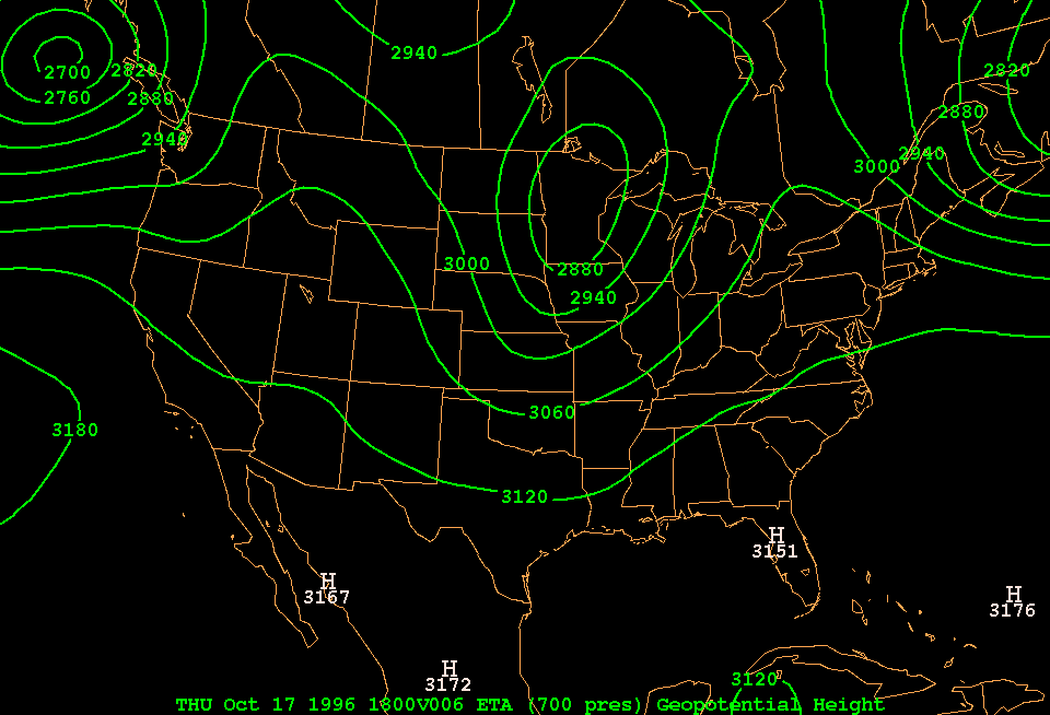
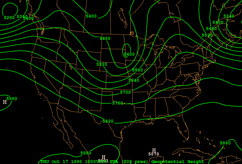
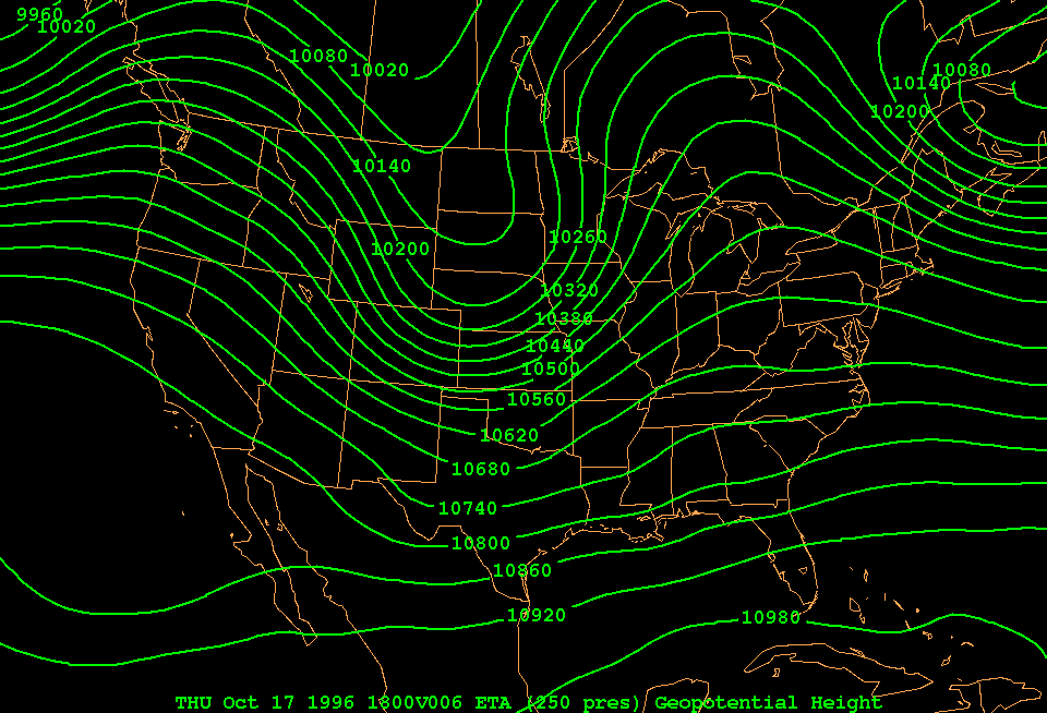
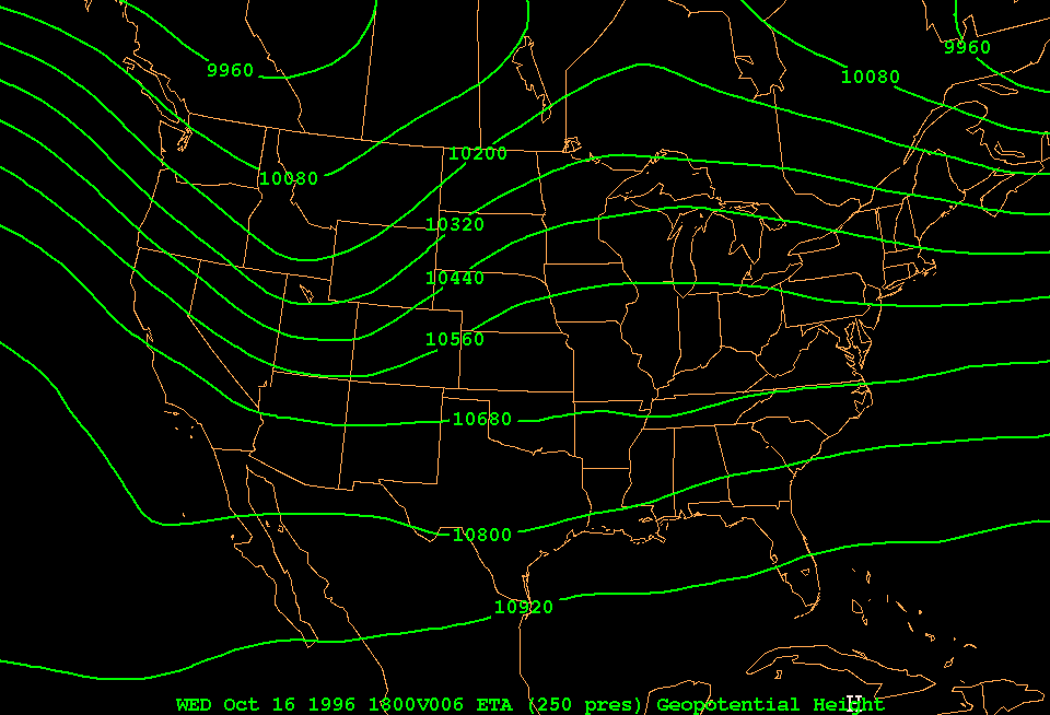
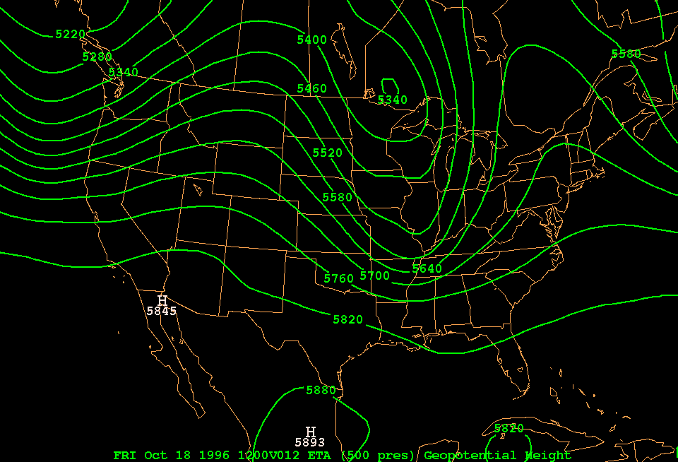
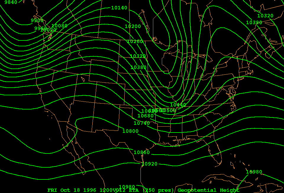
Now let's look at charts starting from near the surface to the tropopause, at 18 UTC on 17 Oct 1996. On each chart, the contour interval is the same: 60 m or nearly 200 ft.
Let's animate this from 1000 to 100 mb. Now answer the questions in the lab manual.
b. The surface low and the jet stream aloft: a synergy
Firstly, examine the evolution of some mid-latitude lows on a polar stereographic map (the North Pole is in the middle). Lows are in dark colors and highs in yellow. The images are 24 hours apart, from 12 Z 16 Oct to 12 Z 19 Oct 1996. The sequence is repeated with an overlay of 500 mb height contours (blue). Now answer these questions:
The discussion in Section II of this Lab, in the manual, can be summarized by the following Figure:
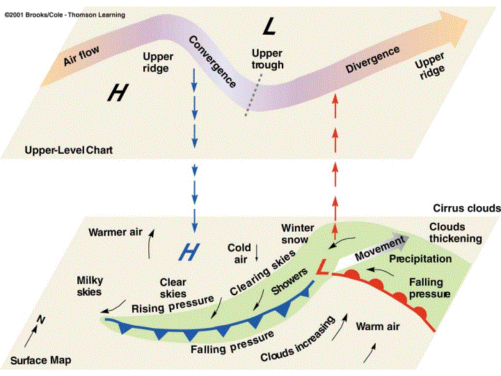
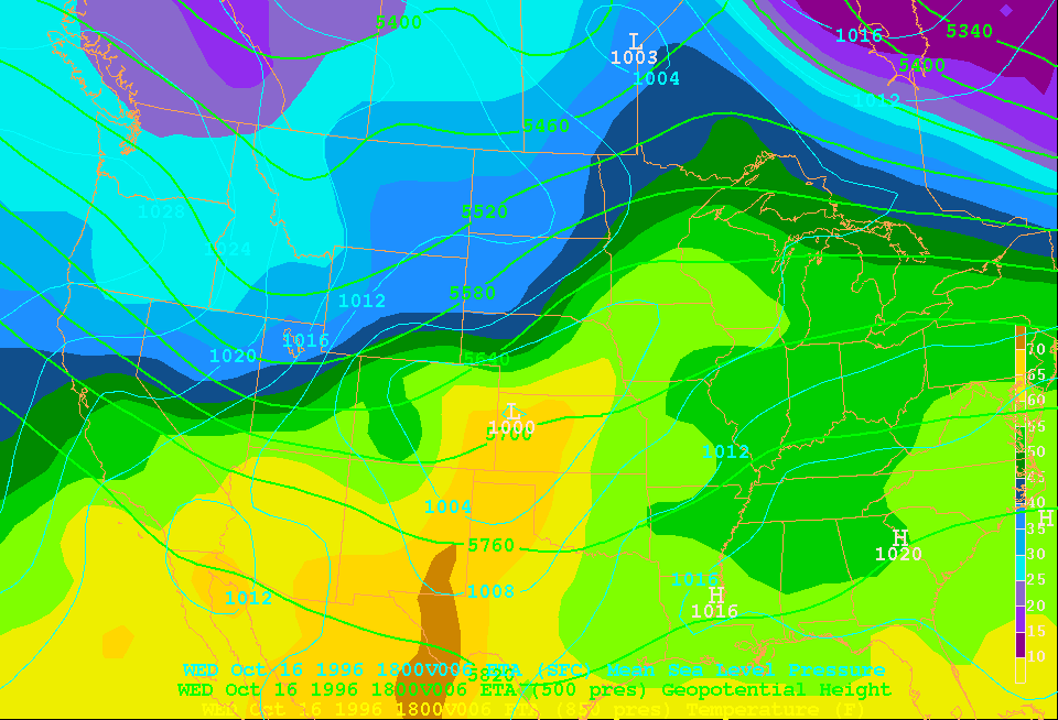
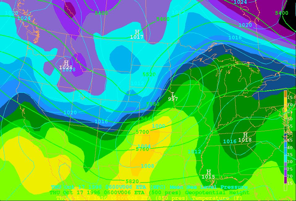
Let' s apply the schematic above to the 12 UTC 17 Oct chart. This chart shows the 500 mb height contours (bold green lines), sea level pressure contours (thin blue lines), and 850 mb temperature (colors). In the quiz below, you have to indicate the location of the upper trough and upper ridge, the surface low and surface high, the cold front, the warm front, the warm sector (the warm air between cold and warm fronts), the area of clearing skies & rising pressure, and the area of falling pressure & thickening clouds. Examine the above schematic carefully, all regions are shown on it.
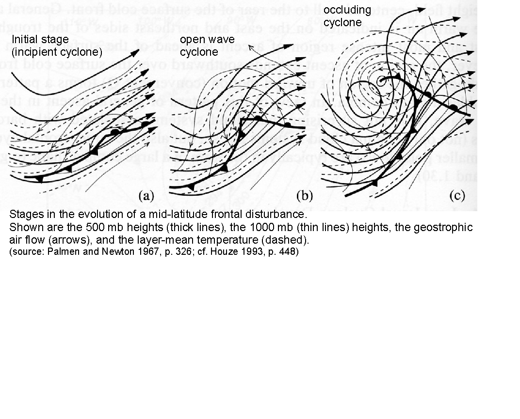
Are you ready? Now click here for the quiz. The frontal disturbance shown in the above schematic is in a stage called the "open-wave cyclone". In this stage, the low tends to deepen further, and there is no occluded front. Now answer these questions in your lab manual:
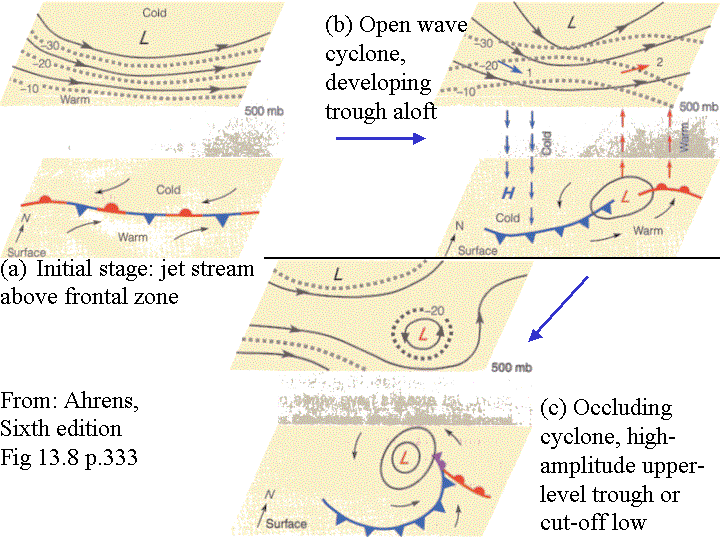
Now view this animation of 9 charts, all of the same type as the one you were just quizzed on. The time interval is 6 hours. Notice how the 500 mb trough moves from west to east, how it amplifies, and how it develops a cut-off low (this is a closed low at upper levels). Notice how at the surface the low deepens, in terms of minimum sea-level pressure, and number of closed contours. And note how the warm and cold airmasses meet near the cold front, how the warm air is drawn up north ahead of the cold front and the cold air advected southward behind the cold front. Towards the end of the sequence the surface low stays back in the cold air, disconnected from the warm sector, almost right below the cut-off low.
c. Lifecycle of a frontal disturbance
We now compare the same sequence to the idealized picture of the development of a typical baroclinic cyclone given in the figure below reproduced from the textbook (Ahrens, Chapter 13). For a top view of the same evolution, click here.
First, let's review the evolution of the frontal disturbance on 16-18 Oct 1996.
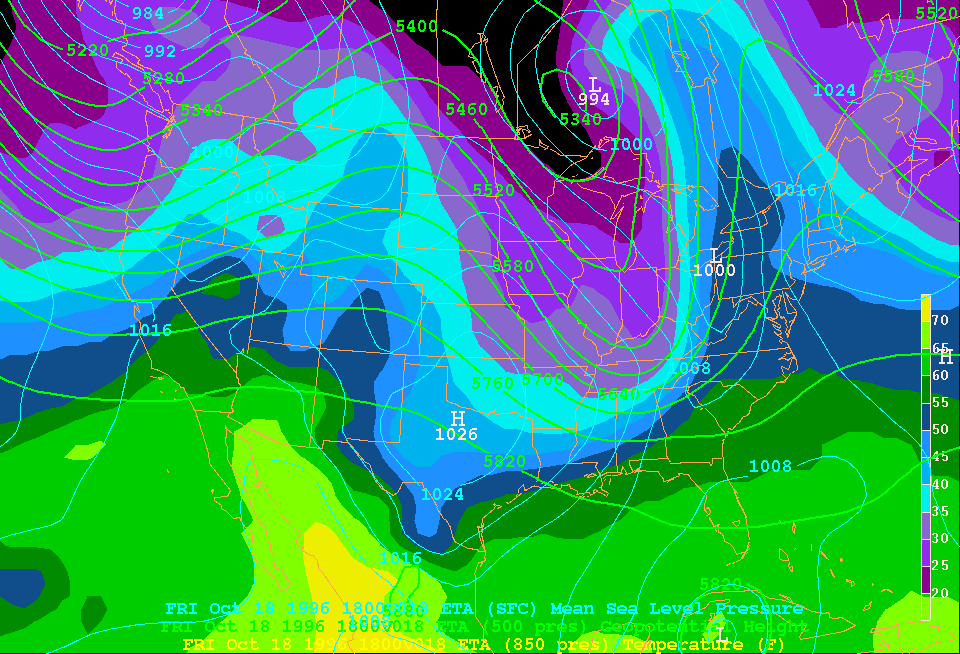
1. Now look at some model-derived charts showing sea-level pressure (thin black contours) and air temperature (colors), and also winds. On this surface chart (click on it) find the surface low, the cold front, the warm front, and the warm sector (located between cold and warm fronts). Click on the chart till you get it right. Now identify A-E on this graph, valid 12 hours later. They can either be a point (high or low), a line (warm or cold front) or a region (warm sector).
2. Compare the surface charts of 00 UTC 17 Oct and 00 UTC 18 Oct. Initially the surface low is in the ........... air, while 24 hours later it is in the ............ air (fill out: cold or warm).
3. When the surface low moves into the cold airmass, the frontal disturbance is said to be in the ……. stage.
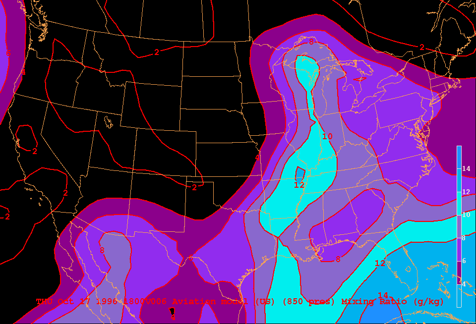
4. Why is there so little precipitation along the cold front initially (say at 13 UTC on 17 Oct), and why does heavy precipitation fall along the cold front when it moves further southeast (say at 00 UTC on 18 Oct)? (Hint: look at the mixing ratio chart, which shows how the cold front is about to run into air much richer in water vapor))
5. Look again at the combined low-level and upper-level structure of the frontal disturbance at 06 UTC on 17 October . Compare to the Figure from the textbook. In what stage is the disturbance at this time (initial stage, open wave cyclone, or occluding cyclone)?
Acknowledgements: this case study is based on COMET case # 14, developed by Unidata which is supported by the National Science Foundation. Thanks also to Lynn McMurdie at the Department of Atmospheric Sciences, University of Washington, who used this case study to illustrate computer-aided instruction in meteorology at the Unidata Workshop "Shaping the Future" held in Boulder on 19-23 June 2000.
For corrections or more information, contact Bart Geerts at Department of Atmospheric Science, University of Wyoming
Last updated: August 07, 2009